


Every year, the wedding industry announces that the following season will change everything. Beige is over. Colour is back. Minimalism is finished. Minimalism has returned, but warmer this time.
The truth is usually less dramatic. Wedding design does not reset itself on 1 January. Ideas move between fashion, interiors, food, art and social media, then couples interpret them in their own way. That last part is where things become interesting.
From what is beginning to emerge for 2027, weddings are becoming richer in texture, less perfectly matched and more interested in atmosphere. Colour is gaining confidence. Lighting is being treated as part of the design. Stationery and tables are becoming more personal. Fashion is bringing stronger silhouettes and tactile fabrics into the room.
Some of these directions photograph beautifully. Some look convincing in a tightly cropped moodboard but become much less practical once real people have to walk, eat, talk and dance inside them.
As a wedding photographer, that is the part I care about. I am not interested in telling you which shade of napkin will make your marriage fashionable. I am interested in how a space feels when it is full, how the light falls on faces, whether your guests can see one another and whether your design still leaves room for the day to happen.
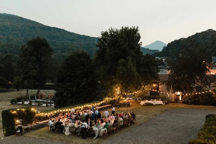
Wedding palettes are becoming less perfectly matched
For several years, many wedding moodboards have been built around one tightly controlled colour and three approved variations of it. Every flower, ribbon, candle and bridesmaid outfit was expected to match. The result could look polished, but it could also make the wedding feel more like a branding exercise than a gathering of people.
For 2027, I expect to see more layered palettes: colours that belong together without being identical. Deep red might meet dusty pink, tobacco brown, pale blue or a green that would never be described as sage. Warm neutrals can still be present, but they no longer have to carry the entire wedding on their beige shoulders.
From a photographic point of view, tonal variation creates depth. It helps different parts of the image separate from one another and gives the eye somewhere to travel. A room made entirely from similar pale tones can be beautiful, but it needs shape, contrast and light to avoid becoming visually flat.
What I like: palettes with a clear direction and enough variation to feel alive. What I like less: adding every predicted colour of the year to the same table simply because they are all fashionable. A palette should begin with your venue, the season and your own taste, not with a screenshot labelled 2027.
Richer colour is returning but it still needs a reason
Berry tones, plum, oxblood, softened yellow, deep blue and expressive pinks are appearing across current fashion and design forecasts. That does not mean every wedding in 2027 will suddenly become maximalist. It does suggest that couples are becoming less afraid of colour that can actually be seen from across the room.
I love colour when it changes the atmosphere of a space. A dark red tablecloth can make candlelight feel deeper. A blue suit can give a portrait a completely different balance. A yellow floral detail can bring energy to a stone venue without requiring an enormous installation.
I am less convinced by colour used as proof that a wedding is original. Five saturated shades, three patterns and a collection of mismatched objects do not automatically create personality. Sometimes they create visual noise and a florist who has not slept for two days.
The strongest colour choices usually involve restraint somewhere else. If the flowers are expressive, the stationery may be quieter. If the clothes are the central statement, the setting can give them room. Good design is not about making every element compete for the first photograph.

Lighting is finally being treated as part of the design
This is the 2027 direction I am happiest to see. Lighting changes a wedding more profoundly than almost any decorative object, yet it is often considered after the flowers, furniture and stationery have already absorbed the budget.
Table lamps, candles, indirect light and carefully placed sources can shape the room, guide guests through the evening and make a large space feel more intimate. Lighting can also mark a transition: brighter during dinner, softer for speeches, more energetic when the party begins.
What photographs beautifully is light with direction and variation. It creates highlights, shadows, reflections and a sense of depth. It lets the atmosphere remain visible instead of forcing every photograph to look as though it was taken under the same ceiling light.
What I would reconsider is strong violet, blue or green uplighting aimed directly at faces. Cameras do not politely ignore it. Skin becomes purple, white clothes absorb the colour and every nearby surface reflects it back. Correcting it afterwards can also remove the atmosphere you paid to create.
If photography matters to you, involve your photographer or lighting designer before the plan is final. A beautiful room and a photographically workable room should not be two different places.
Texture is replacing decorative clutter
Texture is one of the most useful ways to make a restrained design feel considered. Handmade paper, embroidery, glass, ceramics, linen, metal, fruit, sculptural candles and tactile fabrics all respond differently to light. They add detail without requiring every surface to be filled.
This works particularly well in photographs because texture remains interesting at several distances. It contributes to a wide view of the room, then gives meaning to close photographs of a place setting, invitation or outfit.
What I like is materiality: objects that feel chosen, made or connected to the place. What I like less is a table covered with so many miniature decorative items that guests have nowhere to put a glass. Styling should support the meal and conversation, not make everyone afraid to move anything.
The useful question is not ‘What else can we add?’ but ‘What deserves to be noticed?’

Florals are becoming more sculptural and less obedient
Florals for 2027 are moving in several directions at once. We are seeing immersive installations, garden-inspired arrangements, single-variety bouquets and more architectural compositions. The common thread is not one flower or shape. It is a willingness to let flowers create movement rather than sit in identical arrangements at regular intervals.
I enjoy florals that respond to the architecture. A low arrangement can extend the line of a long table. A more sculptural piece can give an entrance or ceremony a clear focal point. A smaller bouquet made from one variety can feel more deliberate than a large arrangement trying to contain every saved reference.
My main reservation is scale without consideration. A centrepiece may look extraordinary in an empty-room photograph and then hide half the table once guests sit down. A ceremony installation may frame the couple beautifully from one precise position while blocking everyone else’s view.
Before approving a large floral structure, imagine the room occupied. Where will people stand? Can they see one another? Can the photographer move? Can the arrangement be repurposed rather than discarded after twenty minutes? The answers are part of the design.
Wedding fashion is becoming more expressive
The influence of fashion is visible in stronger tailoring, liquid fabrics, corsetry, sculptural details, capes, colour and changes of outfit. I am very much in favour of wedding clothes becoming less predictable.
What photographs well is not necessarily the most elaborate garment. It is the outfit that creates a clear silhouette, moves in an interesting way and still allows the person wearing it to behave like themselves. A beautifully cut suit can carry as much visual impact as a dramatic dress. A cape can transform the rhythm of a portrait. Texture can make a simple shape far more compelling in changing light.
What I like less is choosing an outfit exclusively for the photograph you imagine it producing. If you cannot sit, breathe, lift your arms or cross the venue without an emergency team, the garment will affect more than the pictures. The best wedding fashion gives you presence without requiring you to spend the day protecting it.
And no, two people getting married do not need to be assigned complementary masculine and feminine looks. Your clothes can relate to one another through colour, formality, material or complete refusal to coordinate. There is no compulsory visual role to fill.

Personalisation is moving beyond initials on everything
The most interesting form of personalisation is not printing your initials on fifty disposable objects. It is allowing the design to reveal something about the people being celebrated.
That might appear through a menu connected to family history, stationery built around a place that matters to you, a table named after shared references, a textile made by someone close to you or traditions adapted to reflect several cultures and identities.
These details are valuable photographically because they give context. They help the gallery say more than ‘a beautiful wedding happened here.’ They show whose wedding it was.
Personal elements do not need to be explained to every guest or enlarged into a theme. Sometimes a small object, handwritten note or familiar food carries more meaning than a custom logo applied to the dance floor.
Guest experience is becoming part of the visual story
Design conversations for 2027 are increasingly concerned with how guests move, gather and participate. This is a welcome shift. A wedding is not an installation waiting to be photographed before people arrive.
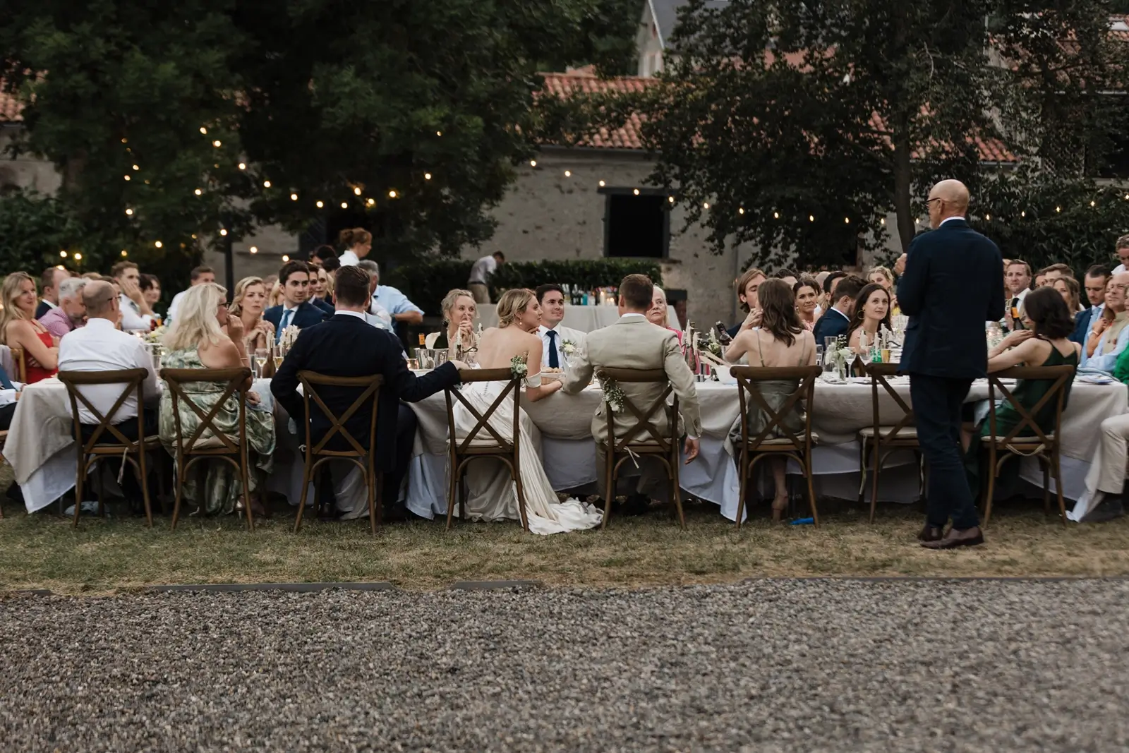
Long tables, changing seating arrangements, family-style meals, interactive desserts and spaces designed for conversation can all alter the energy of the event. For photography, this matters because relationships become visible when the layout allows them to happen.
I like design that encourages people to turn towards one another. I am less enthusiastic about an ‘immersive experience’ that gives guests a schedule of activities so dense that nobody has time for an unscripted conversation.
Not every minute needs an activation. People are capable of creating atmosphere when given food, music, somewhere comfortable to stand and a little unallocated time.
The trend I would happily leave behind
If one idea deserves to disappear in 2027, it is designing a wedding for the moodboard rather than for the people living inside it.
A moodboard is useful. It creates a shared language between you, your planner, florist, designer and photographer. It can reveal that what you call minimal is actually architectural, or that what you call romantic has very little to do with blush flowers and rather more to do with candlelight and old paintings.
The problem begins when the reference becomes a set of instructions. Real venues have dimensions. Real flowers grow in seasons. Real families contain relationships that do not arrange themselves symmetrically. Real weather refuses to read the creative brief.
Your wedding should not feel like a failed version of somebody else’s Pinterest image. The moodboard should help your team understand you, then leave enough room for the day to become its own thing.
What I hope to photograph more in 2027
I hope to photograph colour used with confidence rather than for novelty. I hope to see lighting included early enough to shape the evening properly. I hope clothes become more personal and traditions more optional.
I want to see tables that guests can actually use, flowers that belong to their spaces and design choices that reveal something about the couple beyond their ability to identify a trend.
Most of all, I hope the visual ambition of a wedding continues to coexist with movement, emotion and a certain amount of unpredictability. A beautifully designed wedding does not need to remain pristine. Glasses will move. Napkins will unfold. Flowers will drop petals. Someone will place a phone beside the carefully typeset menu.
That is not the design being ruined. That is the wedding beginning.
Choose a direction that still feels like you
Trends can help you find language for something you already like. They can introduce a colour, material or shape you had not considered. They should not make you feel that your wedding needs to be redesigned every time a new forecast appears.
Begin with the place, the season and the way you want people to feel. Then decide which visual ideas support that experience. A strong wedding design does not need to prove that it belongs to 2027. It needs to belong to you.
If you are planning a wedding in Paris, elsewhere in France or across Europe and want photographs that hold both the visual intention and the life happening inside it, tell me what you are creating. I would love to hear about the colours, references and atmosphere you are drawn to – including the ideas you have already decided to ignore.
Frequently asked questions
What are the main wedding design trends for 2027?
Early directions include richer and more layered colour palettes, tactile materials, intentional lighting, expressive fashion, sculptural florals and more personal guest experiences. These are emerging directions rather than rules every wedding will follow.
Are neutral weddings going out of style?
No. Neutral palettes are becoming warmer and more textured, but they remain relevant. A neutral design needs contrast, material variation and thoughtful lighting to avoid appearing flat in person and in photographs.
Which wedding colours photograph best?
There is no universal best colour. The result depends on the venue, season, available light, surrounding materials and the way colours are combined. A coherent palette with tonal variation generally photographs better than several unrelated trend colours.
Should we show our wedding moodboard to our photographer?
Yes. A moodboard helps your photographer understand the atmosphere, colours and visual references you enjoy. It should be used as context rather than a list of photographs to reproduce.
When should we discuss lighting with our photographer?
Ideally, before the final lighting plan is approved. Your photographer can identify sources or colours that may affect skin tones, speeches, dinner photographs and the overall atmosphere of the gallery.
How can we make our wedding feel personal without following a theme?
Begin with your relationship, families, cultures, favourite places, food, music and the way you host people. Personalisation can be subtle and does not require turning every detail into branded decoration.